
If you've ever watched a service agent try to find a needle in a haystack of data, you know the struggle. That's where Salesforce conditional formatting comes in to save your users from a sea of boring gray text. Look, we've all been there where a record has twenty fields and the most important piece of info is buried right in the middle.
By adding visual cues like icons and colors, you make the data jump off the screen. It's about helping people work faster without having to read every single word on the page. In my experience, this is one of those small changes that gets the biggest "thank you" from the business teams.
Why you should care about Salesforce conditional formatting
So why does this matter? Honestly, most teams get this wrong by cluttering the page with too much info. Salesforce conditional formatting isn't just about making things pretty - it's about cognitive load. When an agent sees a red icon next to a "Discharge" status, they don't even have to read the word to know what's happening. Their brain processes the color and shape instantly.
And here's the thing: clarity is a huge part of being a great admin. If you can show the user exactly what they need to see without them hunting for it, you've done your job. I've seen teams try to build a custom Salesforce notification banner for everything, but sometimes a simple highlighted field is all you really need.
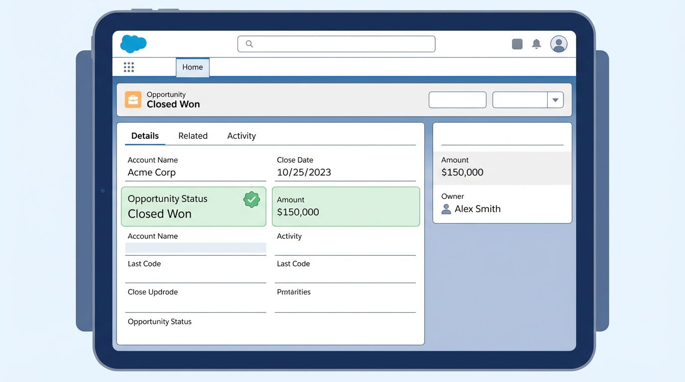
A professional UI mockup of a Salesforce record page where a specific field is highlighted using conditional formatting to stand out from other data.
How to set up Salesforce conditional formatting rules
Now, let's get into the weeds of how you actually build this. You don't start on the record page; you start at the object level. It's a bit different than how we used to do things, but it's much more organized this way because you can reuse the rules.
- Head over to Setup and open the Object Manager. Find your object, like Case or Opportunity, and look for the Conditional Formatting section.
- Create your rules here. For example, if "Census Type" equals "Discharge," you might want a red icon. If it's "Admission," maybe go with green.
- You can even stack conditions. So, if "Continued Stay" is "Yes" and another field matches a specific value, you can trigger a blue icon. It's fairly flexible.
- Save those rules. Once they're saved, they're ready to be picked up by the Lightning App Builder.
One thing that trips people up is color choice. Don't go overboard with twenty different colors. If everything is "important" and highlighted, then nothing is. Keep your palette simple and consistent across the org so users don't have to relearn what "Purple" means on every different object.
Applying rules to the Lightning Record Page
But wait, just because you made the rule doesn't mean it shows up automatically. You have to tell the page where to display it. Open up your record page in the Lightning App Builder and click on the field you want to highlight. In the properties panel on the right, you'll see a dropdown for conditional formatting. Just pick the rule you built earlier.
If you want that "wow" factor, use the Dynamic Highlight Panel. This lets you put those icons right at the top of the record. It's much cleaner than the old-school way of doing things. If you're already moving toward a modern setup, you might also want to look at Dynamic Forms vs Record Types to see how else you can clean up your layouts.
Real-world tips and gotchas
I've worked on plenty of projects where we went a little too wild with icons. One thing I've noticed with Salesforce conditional formatting is that it can get messy if you don't document it. Since the rules live at the object level, make sure your fellow admins know they exist. Nothing is worse than someone trying to figure out why a field is turning blue and not being able to find the logic.
Also, keep accessibility in mind. Not everyone sees color the same way. That's why using icons alongside colors is a smart move. A triangle warning icon is recognizable even if someone can't tell the difference between the red and the orange you picked. Always test your pages with actual users before you go live to make sure the visual cues actually help them instead of just adding noise.
Key Takeaways
- Salesforce conditional formatting lives at the object level, making it reusable across different pages.
- Use the Dynamic Highlight Panel to put important visual cues front and center for your users.
- Stick to a consistent set of icons and colors to avoid confusing the team.
- Always pair colors with icons to ensure the page is accessible for everyone.
- Start small. Highlight the top 2-3 things that actually drive business decisions.
At the end of the day, your goal is to make the system easier to use. Adding these visual markers is a quick win that doesn't require a single line of code. Go into your sandbox, try it out on a high-traffic object like Cases, and see how much faster your agents can triage their work. It's a simple change that makes a massive difference in the daily grind.


Leave a Comment