
Why the LWC datatable tooltip is a quick win
Ever had a user complain about having to click back and forth between records just to see a phone number or an address? It's a classic Salesforce friction point. They're looking at a list of contacts and need to know which account that person belongs to, but they also need the account's details right then and there. Implementing an LWC datatable tooltip is one of the easiest ways to solve this without over-engineering a complex popover component.
Look, we've all been there where we try to build something fancy with custom CSS and event listeners. But sometimes the native features are exactly what you need. By using the tooltip attribute within the datatable's column configuration, you can give users a "hover and see" experience that feels a lot like the old-school mini page layouts from Salesforce Classic.
I've seen teams spend days building custom hover components when a simple native tooltip would've solved the business requirement in twenty minutes. Don't over-complicate things if you don't have to.
Building the Apex backend
First, we need the data. The trick here isn't just getting the Contact record - it's grabbing the related Account fields in the same SOQL query. If you don't pull the Account.Phone or Account.BillingAddress now, you won't have anything to show in your tooltip later.
We use a cacheable method here to keep things snappy. If you are wondering why we use @AuraEnabled, it's basically to make the data accessible to our component while taking advantage of the client-side cache.
public class ContactsController {
    @AuraEnabled(cacheable=true)
    public static List<Contact> getContacts(){
        return [SELECT Id, Name, Phone, Email, AccountId, Account.Name, Account.Phone,
            Account.BillingStreet, Account.BillingCity, Account.BillingState, Account.BillingPostalCode
            FROM Contact
            LIMIT 10 ];
    }
}
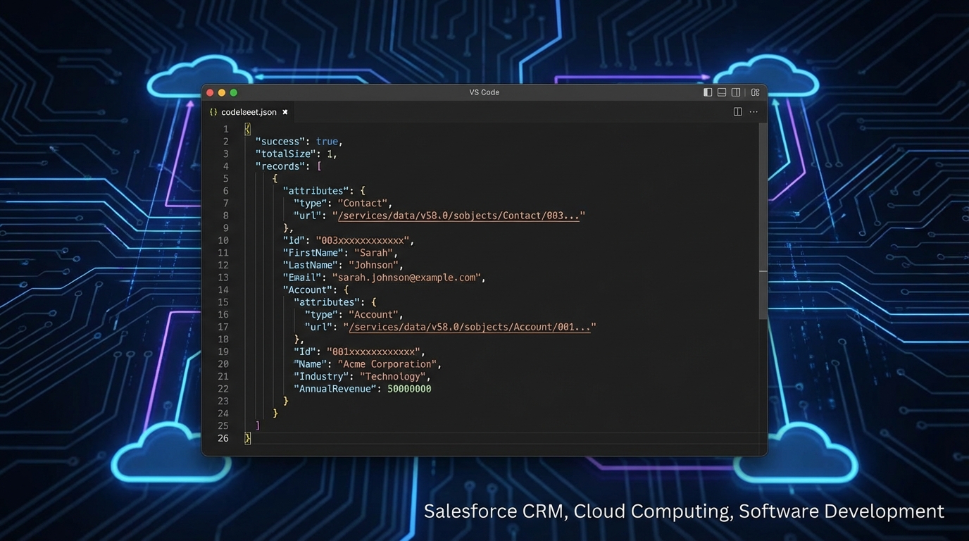
A professional code editor showing a JSON data structure with nested parent-child record relationships.
Mapping data for your LWC datatable tooltip
Here's where it gets interesting. The lightning-datatable doesn't automatically know how to handle nested objects like Account.Name. If you just pass the raw data, your column will stay blank. We need to "flatten" the data in Javascript before handing it over to the UI.
In the wiredContacts function below, we're iterating through the results and creating a few custom properties. We need a URL for the link, a label for the link text, and a formatted string for our LWC datatable tooltip. I like to use the \n character to add line breaks so the tooltip doesn't just look like one long, messy sentence.
import { LightningElement, wire } from 'lwc';
import getContacts from '@salesforce/apex/ContactsController.getContacts';

const columns = [
    { label: 'Contact Name', fieldName:'Name', type:'text' },
    { label: 'Phone', fieldName:'Phone', type:'phone' },
    {
        label: 'Account Name',
        fieldName: 'AccountUrl',
        type: 'url',
        typeAttributes: {
            label: { fieldName: 'AccountName' },
            target: '_blank',
            tooltip: { fieldName: 'accountToolTip' },
        },
    },
];

export default class ToolTipExample extends LightningElement {
    contacts = [];
    columns = columns;

    @wire(getContacts)
    wiredContacts({ error, data }) {
        if (data) {
            this.contacts = data.map((item) => ({
                ...item,
                AccountName: item.Account ? item.Account.Name : '',
                AccountUrl: item.AccountId ? `/lightning/r/Account/${item.AccountId}/view` : '',
                accountToolTip: item.Account ? `Phone: ${item.Account.Phone}\nAddress: ${item.Account.BillingStreet}, ${item.Account.BillingCity}` : ''
            }));
        } else if (error) {
            console.error('Error fetching contacts', error);
        }
    }
}
The HTML Template
The HTML side is actually the easiest part. Since we did all the heavy lifting in the JS file by defining our columns and mapping the data, we just need to drop the lightning-datatable into a card. This keeps your template clean and readable, which is something your future self will thank you for when you have to debug this six months from now.
<template>
  <lightning-card title="Contacts with Account Tooltips" icon-name="standard:contact">
     <lightning-datatable
        key-field="Id"
        data={contacts}
        columns={columns}
        hide-checkbox-column>
     </lightning-datatable>
  </lightning-card>
</template>
Real-world tips for tooltips
One thing that trips people up is null checking. If a Contact doesn't have an Account, item.Account.Name will throw a nasty error and break your whole component. Always use ternary operators or optional chaining when you're digging into related records.
Also, keep in mind that this uses the browser's native tooltip. It's not going to look like a fancy SLDS popover with images and buttons. If your stakeholders are asking for a full "hover card" with action buttons, you'll need to look into a custom solution or a library. But for simple text previews? This is the way to go.
Key Takeaways
- Flatten your data: The datatable can't read
Account.Namedirectly, so map it to a top-level property in JS. - Use \n for breaks: Browser tooltips support newlines, making your LWC datatable tooltip much easier to read.
- Watch for nulls: Always check if the parent record exists before trying to access its fields.
- Keep it light: Don't try to cram a whole paragraph into a tooltip; keep it to 2-3 key fields.
So, next time you're building a list view and want to save your users some clicks, try this out. It's a small detail that makes a huge difference in how the app feels to the end-user. And honestly, it's a lot faster than training them to open links in new tabs every time they need a phone number.


Leave a Comment