
What exactly are Salesforce FlexCards?
If you've spent any time in OmniStudio lately, you've definitely run into Salesforce FlexCards. They're basically the building blocks for creating those slick, data-heavy interfaces without needing to write a mountain of custom LWC code. Think of them as compact, visual summaries that pull in data from all over the place and give users a way to actually do something with that info.
I remember the first time I had to build a customer 360 view. We were trying to show billing status, recent cases, and active assets all in one spot. Before OmniStudio, that was a headache of custom components. But with Salesforce FlexCards, we could just map the data, drag some elements around, and it was done. It's about getting contextual information in front of people so they don't have to hunt through ten different tabs.
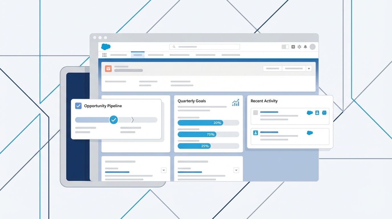
A professional CRM dashboard mockup featuring a modular layout of data cards and UI elements.
How Salesforce FlexCards actually work
Look, the technical side is pretty straightforward once you get the hang of the designer. A FlexCard is really just a combination of data and UI elements. You've got your data sources - which could be anything from a standard object to a complex Integration Procedure or even an external API call. If you're curious about how those connections happen, it's worth brushing up on the differences between SOAP vs REST because you'll be using both as data sources.
Once the data is in, you use "slots" to show it. You can drop in text, images, icons, or even other FlexCards. That's right - you can nest them. I've seen teams build massive, messy cards when they should have just used child cards. Trust me, keep your main cards simple and use child cards for the repetitive stuff. It makes debugging much easier later on.
The power of actions and conditions
But here's the thing: a card that just shows data is only half the story. The real value comes from actions. You can add buttons or clickable areas that launch an OmniScript, navigate to a record, or trigger a background process. And it's all declarative. You don't have to write a single line of JavaScript to make a button open a new case.
Conditional rendering is another one of those features that saves so much time. You can set rules to show or hide parts of the card based on the data. For example, if a customer's account is past due, you can make a big red "Late Payment" badge appear. If everything is fine, the badge stays hidden. It keeps the UI clean and only shows the user what they actually need to see right now.
Real-world benefits of Salesforce FlexCards
So why do we use them instead of just sticking with standard Lightning record pages? The short answer? Flexibility. You can combine data from three different systems into one card. That's a huge win for agent productivity. I've worked on projects where we reduced "click-fatigue" by 40% just by putting the right actions directly on the FlexCard.
Another big plus is reusability. You can build a "Product Tile" card once and use it in a console, a mobile app, and a public-facing portal. But a quick tip from someone who's been there: you need a plan for your names. If you don't follow FlexCard naming conventions, your org will turn into a graveyard of "Test_Card_v1" and "New_Card_Final" very quickly.
A look at the underlying structure
Even though we build these in a drag-and-drop editor, there's a JSON definition running the show behind the scenes. You won't usually edit this directly, but it's good to know what's happening under the hood. Here's a simplified look at what a card definition might look like:
{
  "Type": "FlexCard",
  "Name": "AccountOverview",
  "DataSources": [
    {"name":"GetAccountData","type":"IntegrationProcedure","key":"Account_Details"}
  ],
  "Elements": [
    {"type":"text","value":"{AccountName}"},
    {"type":"action","label":"Edit Account","actionType":"Navigate"}
  ]
}
When should you actually use them?
Don't just use Salesforce FlexCards for everything because they're the "new shiny tool." Use them when you need to show related data that isn't easily accessible through standard related lists. They're perfect for things like policy summaries, weather widgets, or any scenario where a user needs to see data and take a quick action immediately.
In my experience, they're also the best way to handle "read-heavy" interfaces where you're pulling from external systems. Since they're lightweight and optimized for performance, they won't bog down your page load times as much as a bunch of custom LWCs might if they aren't built perfectly.
One thing that trips people up is data volume. If you're trying to load 500 rows of data into a single FlexCard, you're going to have a bad time. Use Integration Procedures to trim your data down to exactly what the UI needs before it ever hits the card.
Key Takeaways
- Salesforce FlexCards are declarative UI components used to show contextual data and actions.
- They can pull data from multiple sources, including APIs and internal Salesforce objects.
- Actions allow users to launch workflows or navigate directly from the card.
- Conditional rendering keeps the interface clean by showing only relevant info.
- Reusability is the name of the game - build once, use across multiple channels.
Wrapping it up
At the end of the day, Salesforce FlexCards are about making life easier for the end user. If you're heading into an interview, be ready to talk about how you've used them to solve a specific business problem. Don't just list the features - explain how you used a card to help an agent close a case faster or how you used conditional styling to highlight a critical customer issue. That's what people really want to hear. Start small, get your data mapping right, and you'll see how much faster you can build out a solid UI.


Leave a Comment