

Why LWC Design Attributes are worth setting up
If you've ever built a component and then had an admin ask you to change a label five times in one afternoon, you already know the problem LWC Design Attributes solve. These are the properties we expose to the Lightning App Builder so non-developers can tweak things without us touching the code. It makes our components flexible and, more importantly, it stops us from getting bogged down in minor UI requests.
I've seen teams hardcode everything from titles to hex colors straight into their components, and it turns into a maintenance nightmare. Design attributes turn the same component into a template anyone can customize. Whether it's for a record page or an Experience Cloud site, letting an admin change a component's behavior with a checkbox or a text field is smart engineering.
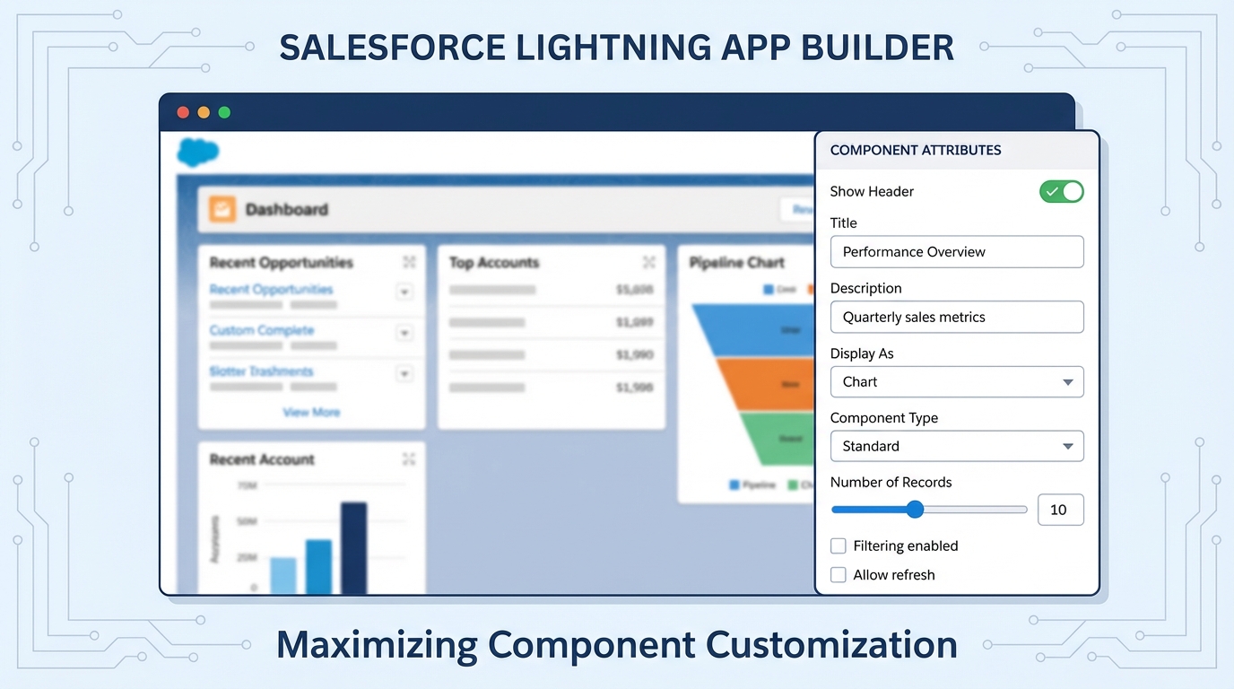
A realistic UI mockup of the Salesforce Lightning App Builder showing the property panel with various admin-configurable settings for a custom component.
Setting up your LWC Design Attributes in the metadata
The work happens in your component's configuration file: the .js-meta.xml you usually ignore after setting isExposed to true. That file tells Salesforce which properties show up in the builder UI, what type of input each one takes, and what the default values are.
Here's a basic configuration for a header component. We're exposing a string for the title and a boolean to toggle an icon. It's a good starting point for a reusable LWC for Flow or standard pages.
<?xml version="1.0" encoding="UTF-8"?>
<LightningComponentBundle xmlns="http://soap.sforce.com/2006/04/metadata">
  <apiVersion>60.0</apiVersion>
  <isExposed>true</isExposed>
  <targets>
    <target>lightning__AppPage</target>
    <target>lightning__RecordPage</target>
  </targets>
  <targetConfigs>
    <targetConfig targets="lightning__RecordPage">
      <property name="headerTitle" type="String" label="Custom Title" default="Recent Updates"/>
      <property name="showIcon" type="Boolean" label="Display Icon?" default="true"/>
    </targetConfig>
  </targetConfigs>
</LightningComponentBundle>
The XML isn't enough on its own. Your JavaScript has to listen for these values, and that's what the @api decorator does. Skip it and the builder may still show the property, but your component won't react to anything the admin types in.
import { LightningElement, api } from 'lwc';

export default class MyComponent extends LightningElement {
  @api headerTitle = 'Recent Updates';
  @api showIcon = true;
}
Handling complex LWC Design Attributes like picklists
What trips people up is limiting what an admin can choose. A free-text field invites someone to type "Red" when the CSS only supports "red-500". Picklists are safer, because they force a choice from a list you defined.
For "Themes" or "Layout Styles" I've found picklists are the best way to keep the UI consistent. You define the datasource in your XML and it renders as a dropdown menu in the Lightning App Builder. Small detail, but the admin experience feels much more polished.
If you need a dynamic picklist that changes based on other settings, look into Dynamic Picklists for LWC. It's more work, but worth it for complex tools.
So what types can you actually use? Most of the time, you'll stick to these:
- String, for text inputs and labels.
- Boolean, for simple on/off switches (checkboxes).
- Integer or Double, for numbers like record limits or padding values.
- Color, which shows a native color picker in the builder.
- Picklist, for restricted choices through a dropdown.
Common mistakes and troubleshooting
Most teams get this wrong the first time they try to scale their components. The biggest issue I see is forgetting that design attributes are tied to specific targets. Define a property for lightning__RecordPage, then drop the component on a Home Page, and the property won't show up. You have to be intentional about where these attributes live.
If your property isn't showing up in the App Builder, check these three things first:
- Is
isExposedset to true? (We've all forgotten this one). - Does the property name in the XML exactly match the
@apiproperty in your JS? It's case-sensitive. - Did you clear your browser cache? The Lightning App Builder is notorious for caching old versions of the metadata.
Keep an eye on how your component handles data internally, too. If you are doing complex LWC component communication, make sure your design attributes aren't clashing with values being passed in from parent components.
Best practices for LWC Design Attributes
After building dozens of these for different clients, I've developed a few rules of thumb. First, don't over-expose. You can make every single CSS margin a design attribute, but you'll end up with a sidebar that's five miles long and confuses everyone.
Second, always provide sensible defaults. If an admin drags your component onto a page and it looks broken because no text is filled in, that's on you. Make it look good out of the box. Finally, use clear labels. "Property1" means nothing to an admin. Use "Sidebar Heading" or "Number of Records to Show" instead.
Key takeaways
- LWC Design Attributes live in the
.js-meta.xmlfile and must match an@apiproperty in your JS. - They allow admins to customize components without writing a single line of code.
- Always use picklists instead of strings if you need to restrict user choices.
- Properties are target-specific, so make sure your
targetConfigsmatch where the component is used. - Keep the builder UI clean by only exposing what's actually necessary for the business.
These attributes exist to make your life easier. The less time you spend making tiny CSS tweaks for stakeholders, the more time you have for the actual logic. Start small by exposing a few labels, and you'll quickly see how much further your components stretch across the org.



Leave a Comment