


If you're tired of building rigid components that break the moment a requirement changes, learn LWC slots. Slots are placeholders that let a parent component inject its own markup right into a child component, which makes your code far more flexible.
I've seen teams struggle with massive components carrying twenty different @api properties just to hide or show certain buttons. It's a maintenance nightmare. Rather than hard-coding every possible variation, I use slots and let the parent decide what goes where. You build a shell and the consumer fills in the blanks.
Why I always reach for LWC slots
Think of a slot as a "reserved seat" in your component's HTML. The child component defines where the seat is, and the parent component chooses who sits there. That helps a lot when you're trying to build a progress bar or a card that needs to look different depending on whether it's on a dashboard or a record page.
There are two types you'll use: unnamed (default) slots and named slots. An unnamed slot is the catch-all. If the parent passes content without a specific destination, it lands right there. Unnamed slots are the easiest way to start making your UI primitives reusable.
// cardComponent.html
<template>
  <div class="slds-card">
    <div class="slds-card__header">
      <h2>Standard Card</h2>
    </div>
    <div class="slds-card__body">
      <! - Anything the parent sends will show up here - >
      <slot></slot>
    </div>
  </div>
</template>
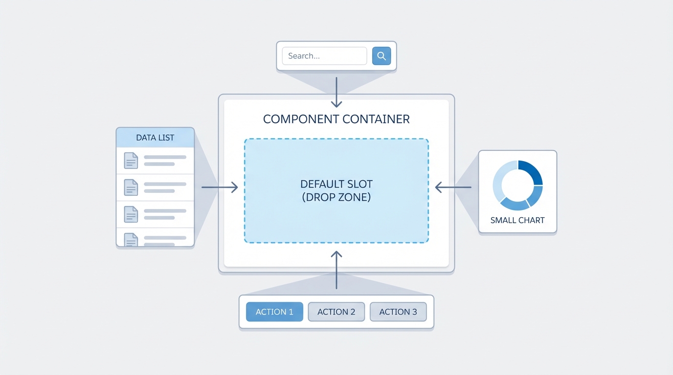
A default LWC slot: a component container receiving different UI elements into one central placeholder.
Taking control with named LWC slots
Sometimes a single placeholder isn't enough. If you're building something like a modal, you need specific spots for a header, a body, and a footer. That's what named slots are for. You give the slot a name attribute, and the parent targets it using the "slot" attribute on its own elements.
I use this pattern for almost every layout-heavy component I build. It keeps the CSS inside the child component consistent while giving the parent full control over the actual data and actions. It also makes LWC component communication much cleaner, because the parent keeps the logic for the buttons it's injecting.
// modalComponent.html
<template>
  <section class="slds-modal slds-fade-in-open">
    <div class="slds-modal__container">
      <header class="slds-modal__header">
        <slot name="header">
          <h2>Default Title</h2>
        </slot>
      </header>
      <div class="slds-modal__content">
        <slot></slot> <! - Default unnamed slot for body - >
      </div>
      <footer class="slds-modal__footer">
        <slot name="footer"></slot>
      </footer>
    </div>
  </section>
</template>
Checking if a slot is empty
One thing that trips people up is trying to hide a wrapper div when no content was passed to a slot. You can't just use an "if:true" on the slot itself. You have to go into the JavaScript and use assignedElements(). I've used this many times to hide a footer section entirely when the parent didn't provide any buttons, so the UI doesn't sit there looking clunky with empty white space.
// modalComponent.js
get hasFooter() {
  const footerSlot = this.template.querySelector('slot[name="footer"]');
  return footerSlot && footerSlot.assignedElements().length > 0;
}
Always provide default content inside your slot tags. It acts as a fallback so your component doesn't look broken if someone forgets to pass content to it.
Best practices from the field
- Keep your slot names simple and descriptive like "header", "actions", or "sidebar".
- Don't go overboard. If you find yourself adding ten slots to one component, you might actually need to break that component down into smaller pieces.
- Remember that styles in the parent component don't automatically bleed into the child, but the content inside the slot is still technically part of the parent's DOM tree.
- Use conditional rendering in the child to handle empty slots gracefully so you don't end up with weird margins or borders.
Key takeaways
- Slots are the best way to handle content projection and build reusable UI primitives.
- Named slots give you multiple injection points for complex layouts like modals or grids.
- Slotted content stays in the parent's context, which makes event handling and styling much more intuitive.
- Use
assignedElements()in your JS if you need to detect whether a slot actually has content.
So the next time you're about to add yet another boolean property to a component just to show a specific icon or button, stop and try a slot instead. Your components get much easier to maintain, and nobody has to hunt through a mountain of props to change a bit of text.


Leave a Comment