


Choosing the right Salesforce report types for your org
Choosing the right Salesforce report types sounds easy until you are staring at a blank screen with a stakeholder behind you. I have spent years fixing reports that were built the wrong way, and it almost always comes down to a format that stopped scaling as the data grew. Dashboards people trust start with knowing which tool to grab from the toolbox.
You build a quick list, and three weeks later the VP of Sales asks for a chart and a breakdown by region. The simple list stops working. Knowing how each format behaves saves you from rebuilding everything from scratch.
Breaking down the four Salesforce report types
Salesforce gives us four main ways to look at data, and each one has a specific job to do. Force a tabular report to do a matrix report's job and it will not end well.
1. Tabular Reports
Think of this as your basic Excel spreadsheet. It is just a list of records with no groupings. I mostly use these to export data or check a quick list of "My Open Tasks" or "Active Users."
The catch: you cannot build dashboard charts from a tabular report unless you limit the rows. Totals, or data grouped by a specific field, need something more flexible.
2. Summary Reports
This is the workhorse of the ecosystem. Most of the Salesforce report types you build will be summary reports. They let you group rows of data, so you can group all your Opportunities by "Stage" or "Account Owner."
This is the format for subtotals and dashboard charts. In my experience, when you are not sure which type to pick, start with a summary report. It is the most versatile option for 90% of business requests.
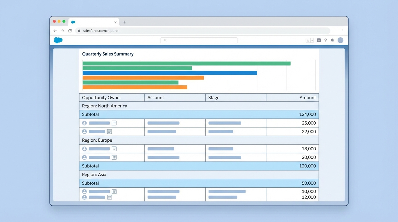
A Salesforce summary report with grouped data rows, subtotals, and a summary bar chart.
3. Matrix Reports
Matrix reports compare data across two different dimensions, grouping by rows and by columns at the same time. It is a pivot table inside Salesforce. I use these for things like "Revenue by Month (Columns) and Product Category (Rows)."
They are harder to read at a glance, and very good at showing how segments move over time. Keep an eye on your filters: with large data volumes, a matrix report that is too broad can get sluggish.
4. Joined Reports
Most admins avoid joined reports because they look intimidating. They earn their keep when you need two different types of information side-by-side. One block can show "Sales Rep Quotas" and another can show "Closed Won Deals" for that same rep.
Joined reports are the only way to show data from different report types in a single view. If a stakeholder wants to see "Leads" and "Opportunities" in one report, this is your path forward without building some crazy custom object.
Why custom Salesforce report types matter
Standard report types handle the basics and then fall short once the data relationships get complicated. That is where custom report types come in. They let you define exactly which objects and fields are available to your users. This guide on standard vs custom report types covers when it is time to build your own.
One thing that trips people up is the "with or without" relationship. If you use a standard report for "Accounts with Contacts," you will not see any Accounts that do not have a Contact. To see every Account regardless of whether it has a Contact, you have to build a custom report type with "A may or may not have B" logic.
Advanced reporting features to keep in your back pocket
- Bucket fields group values on the fly without asking a dev to create a new field. Think "Small, Medium, Large" based on deal size.
- Cross filters answer "which Accounts have no Cases?" without a single line of code.
- Row-level formulas handle quick math, like the number of days between two dates, right on the report. I use them constantly.
Running reports via the API
Sometimes you need this data out of Salesforce programmatically. For a developer that usually means the Analytics REST API, and it is straightforward. You hit the report endpoint with a GET request:
GET /services/data/v62.0/analytics/reports/{reportId}
That returns a JSON blob of your data and groupings. It is much cleaner than scraping the UI or running heavy SOQL queries for complex aggregations. I have used it to feed custom LWC components when the standard report charts were not enough.
Key takeaways
- Tabular for simple lists and data exports.
- Summary for most dashboard charts and for grouping data by one field.
- Matrix for two-dimensional comparisons, the pivot table case.
- Joined to compare different datasets, like Leads vs. Accounts, in one view.
- Custom report types whenever the standard ones hide records you need to see.
The best report is the one that actually gets used. Do not over-complicate things just because you can. Start with the simplest format that answers the business question. If you find yourself building the same report over and over with slight variations, it might be time to look into dynamic filters or even AI-driven insights so your users can find what they need faster. Keep it simple and keep it fast.



Leave a Comment